3 Effective Donation Page Elements (That Actually Work)

By now, we hope you’ve heard of the internet. It’s kind of a big deal. A big deal to the point that an online donation page or donation form can make or break your nonprofit fundraising goals. Email marketing is on the rise and even older donors are behind online giving! In a world where online donors are increasing every year, creating a powerful online donation page should be at the top of your priority list.
Ready to ramp up your online donations and take your online giving to the next level? Here are three essential elements of an effective donation page.
1. Keep it simple
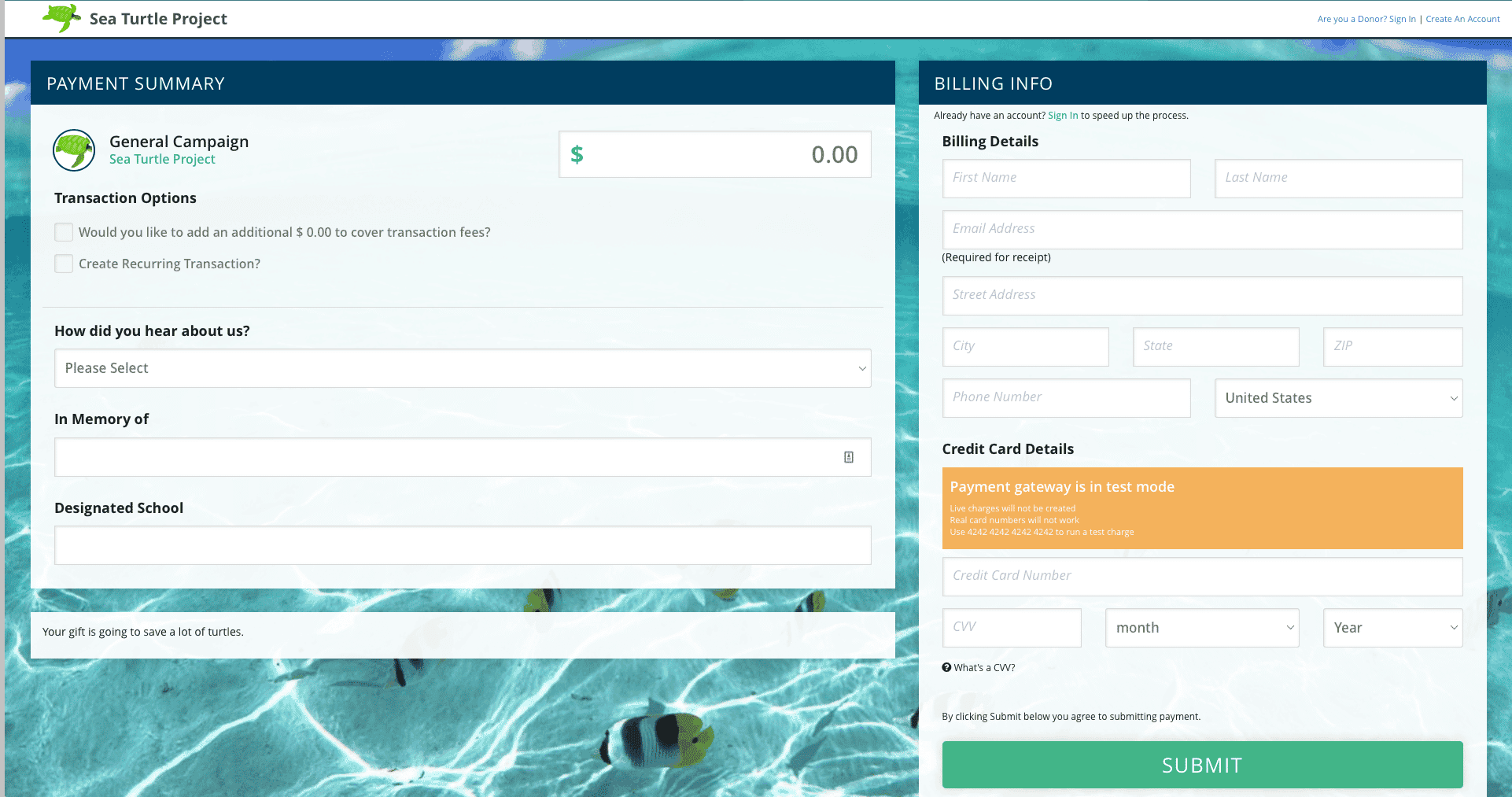
When it comes to securing online donations, the last thing you want is a complicated donation page. Lengthy donation forms and pages with disorganized layouts or too many fields may deter potential donors from giving. To create an effective donation page, here are 2 ways to keep it simple:
- Reduce clicks. Don’t make your donors jump through hoops to make a donation (unless you’re fundraising for Barnum & Bailey). Try to capture all the information you need in just 1 or 2 screens, asking for only the most necessary information. A multi-screen donation process with multiple clicks and redirects will lower their chances of clicking that final donate button.
- Reduce distractions. Your online donation form should be just that – a donation form. Remove anything distracting leading away from the donate button before they submit. Keep your donation form clean and free of any external links so that users can make it through the process quickly without being sidetracked. And if you’re dying to share a video or link with donors, save it for your donor receipt.
Giving donors a simple, frictionless giving experience is vital. Finding a platform that will allow you to create this type of opportunity is essential. Creating a donate button anywhere on your site, where a mobile user can quickly and easily fill out a donation form will lead to tremendous success for your fundraising conversions.
Another option would be to gather a bit more information on a donation page. This would allow you to glean info like a physical address or campaign choice. Not as smooth on an iPhone or Android, but these can be laid out intelligently to make sure donors find the donate button before delving through a page for minutes on end.
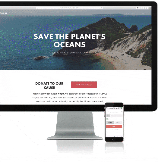
2. Stay on brand
A simple online donation page is imperative, but that doesn’t mean you have to sacrifice your nonprofit’s branding. A branded donation page can actually raise a donation amount 38% over a generic page. When people give to your organization, they want to make sure that they’re in the right place and on the right donation form. Keep your donation pages consistent with your nonprofit imagery and language, while making sure they don’t have any unnecessary distractions.
3. Give donors choices
When a constituent makes the choice to become a donor, there are a few more decisions they’ll have to make. Giving your donors the freedom to choose how, when, and how much they give will set up your nonprofit fundraising goals to succeed. But just like any effective marketing campaign, it’s not about giving users dozens of options to choose from (that could actually lead to decision-making paralysis). It’s about giving them smart options. We’ve thought of 3 ways that you can give your donors the opportunity to choose their own donation adventure.
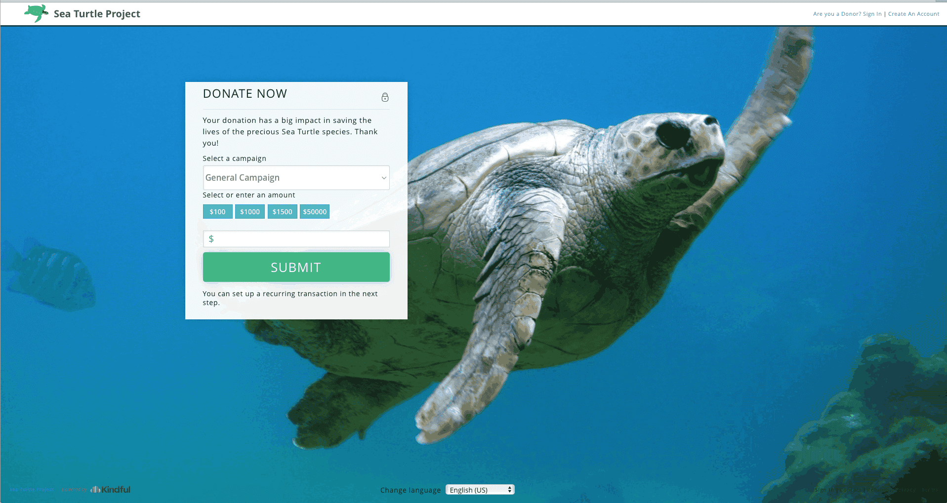
- Campaign options. Raising money for a new building? Kicking off a new focus or vision? Give donors the ability to choose which fundraising campaign they would like to contribute to.
- Amount options. By providing 3 or 4 donation options with space for a custom amount, you can help first-time donors understand what the average supporter contributes. (Bonus: by including a few high-dollar amounts, you may even be able to subtly push donors to give more.)
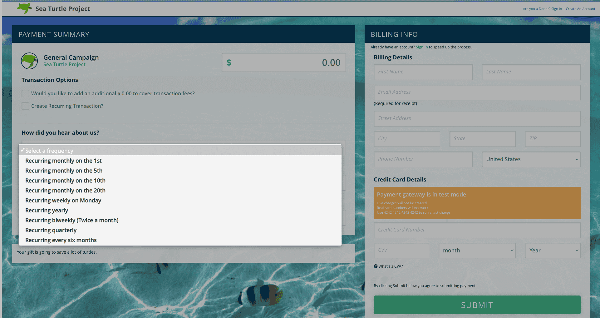
- Frequency options. Your donation form should always include the option to turn a single contribution into a monthly gift. Include it in your main donation form so a single donation always has the option to convert into a lifetime donor.
Upgrade your donation page experience
By making your online donation page simple, branded, and inclusive of options, you can optimize your online fundraising and grow your organization. Providing donors with a frictionless giving experience is becoming paramount. According to M+R Benchmarks, only 1.2% of your website visitors donated in 2016. We definitely think it’s time to improve on that statistic – and we think a smoother online donation experience is the yellow brick road.
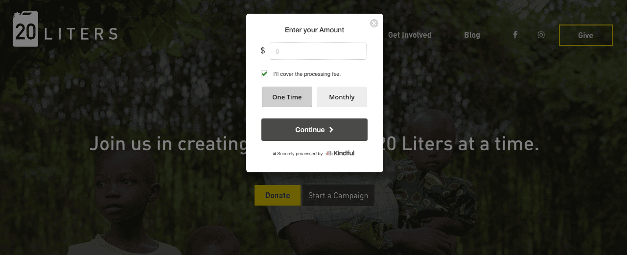
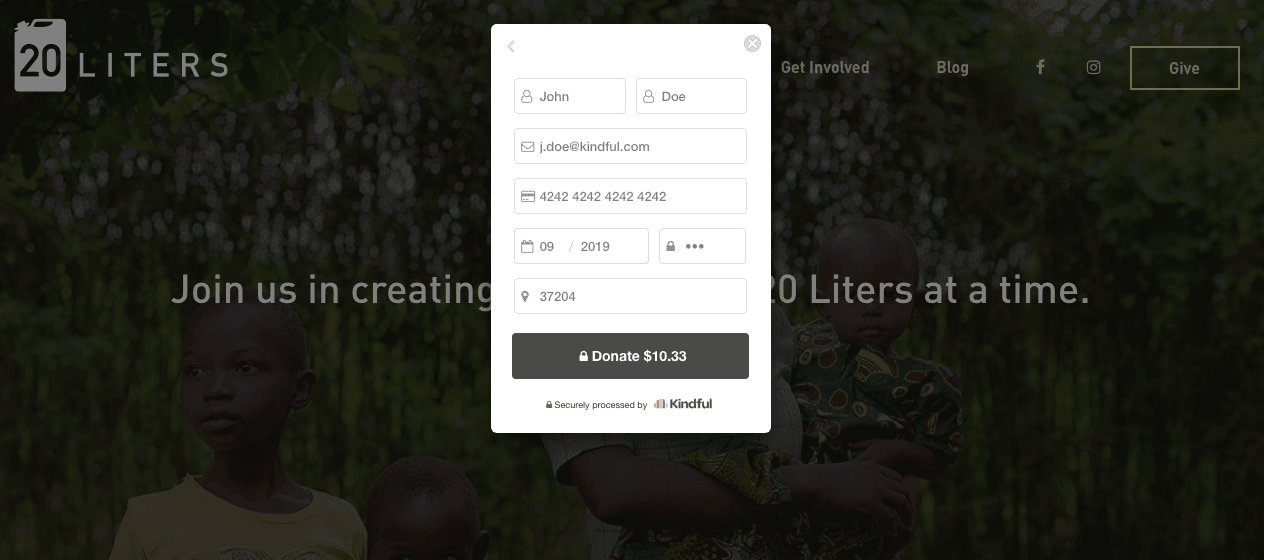
Check out how 20 Liters accomplishes this right on their home page. You see the compelling image, read a branding statement, and you’re ready to donate. A single click or tap on the donate button brings up a streamlined donation form right on their webpage, and after a few seconds and some auto-fill, donors have submitted and are right back onto the website. Easy, breezy, and beautiful donating.
Schedule a live demo with Bloomerang, and we’ll show you how easy it is to create and automate reports, utilize online and offline fundraising tools, quickly integrate and access all your data, and ultimately create more time to engage your donors.